Scaling a design system
Building and evolving a multi-brand design system through team growth, mergers, and product integrations.
System details
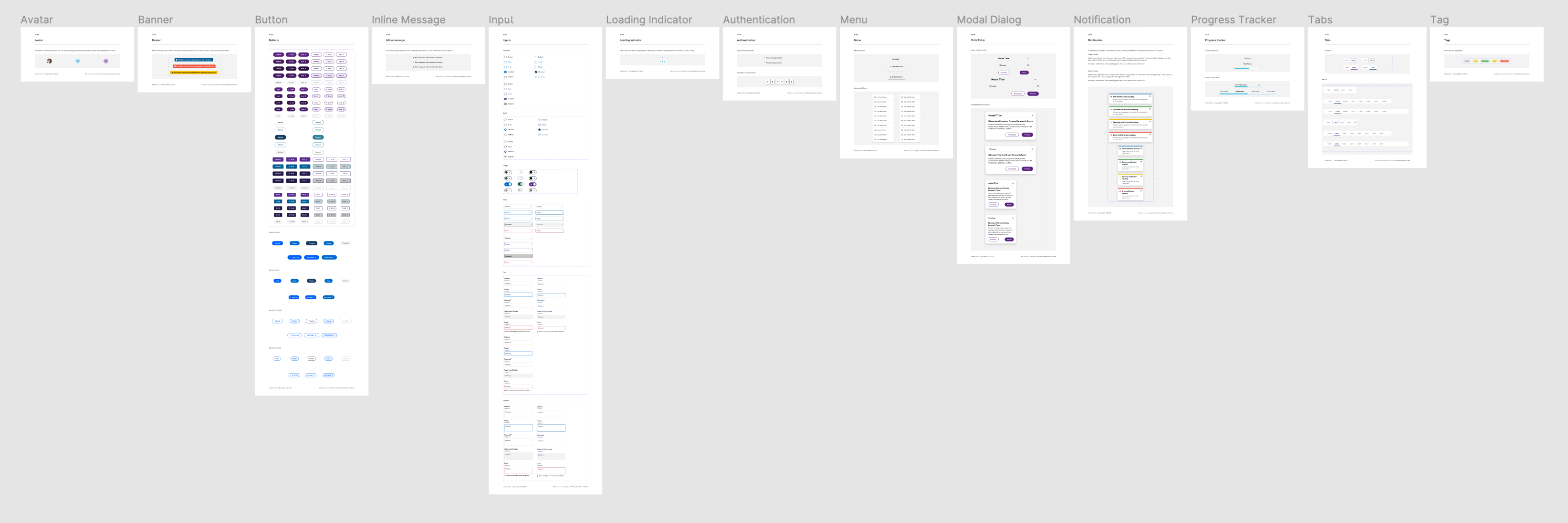
The Pulse Design System is a collection of shared user interface resources including styles, components, and patterns for use across Teladoc Health products. These resources are available to product designers and developers as platform libraries, and are accompanied by usage documentation and support from the Pulse team.
Clients
50 designers and 350 developers
Technology platforms
Figma, React, iOS, Android, server-driven UI
Components and patterns
70+ components and patterns
Styles
200+ color, type, spacing, radius, and effect styles shared through an end-to-end design token system
Documentation
Contextual (in Figma and software development environments) and online in a central resource
Objective
The Pulse Design System serves to provide cohesive, high-quality, accessible, and brand-consistent experiences to Teladoc Health users while enabling teams to ship products more efficiently. Pulse provides an extensible foundation that allows teams to focus on innovation.
Challenge
Livongo Health was a startup operating with a scrappy mindset. With growth as the priority, the visual language and user experience across Livongo products had become inconsistent over time. Common interface elements looked different across experiences and sometimes even within a single page.
In 2020, I joined a small team of designers researching and creating the foundations of a design system — Pulse Design System — to address these inconsistencies and improve product development efficiency.
A few months into the initiative, Livongo was acquired by Teladoc Health. Teladoc sought to leverage Pulse and expand it to suit the broader needs of the organization.
As a much larger company, Teladoc needed a mature design system to accommodate:
- A broad suite of products
- Multiple user groups, including members, providers, and administrators
- Multiple technology platforms, including web, native mobile, TV, and medical devices
- International operations
- Multiple in-house brands
- White-labeling products for other brands
- Strict accessibility and regulatory requirements
Approach
Inspiration
We found inspiration in well-established design systems, interpreting our learnings to match the needs of our own organization and resourcing. We participated in design systems conferences and incorporated emerging best practices and innovative technologies into our workflows.Prioritization
In early releases, we prioritized simple components that occurred frequently in our products, including form inputs, buttons, and modals. We now use RICE (Reach, Impact, Confidence, Effort) scoring to make informed decisions about our roadmap and to ensure we address the needs of our clients, around 50 designers and 350 developers as of 2023.
